Steven King was a big reason as to why I started to read again. This project is a tribute to him and his fans. I used five books ranging from his older to newer works and wanted to redesign the covers. This was a fun experimentation into other forms of media as well as playing with type. Below you will see the process as well as the final outcomes!

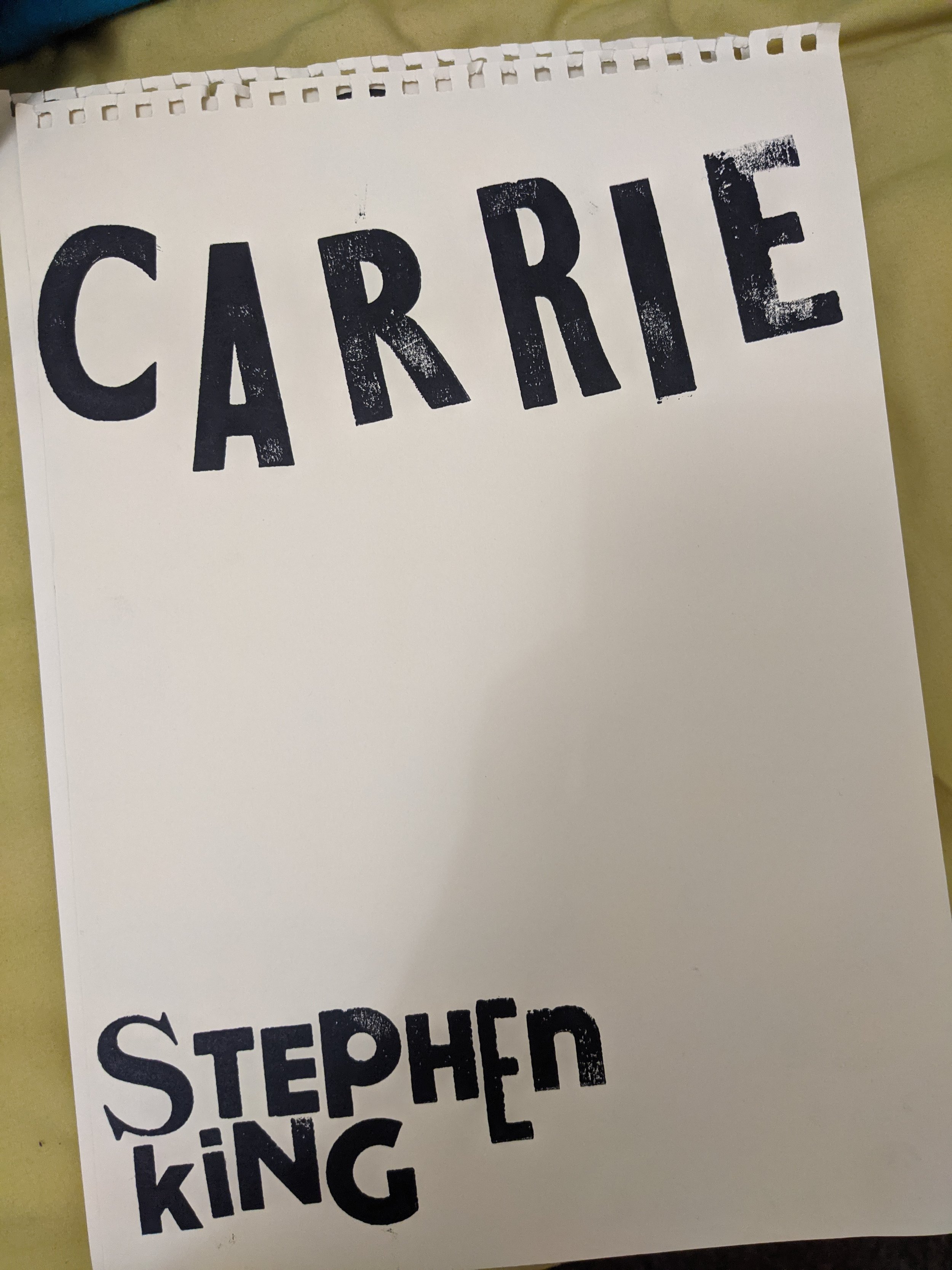
Before this, I had never used a letterpress. I got a tutorial and discovered that it's not only simply but extremely fun! Using the wood to hold the type in place was useful, although I didn't worry too much about it as I love how it looks misaligned.
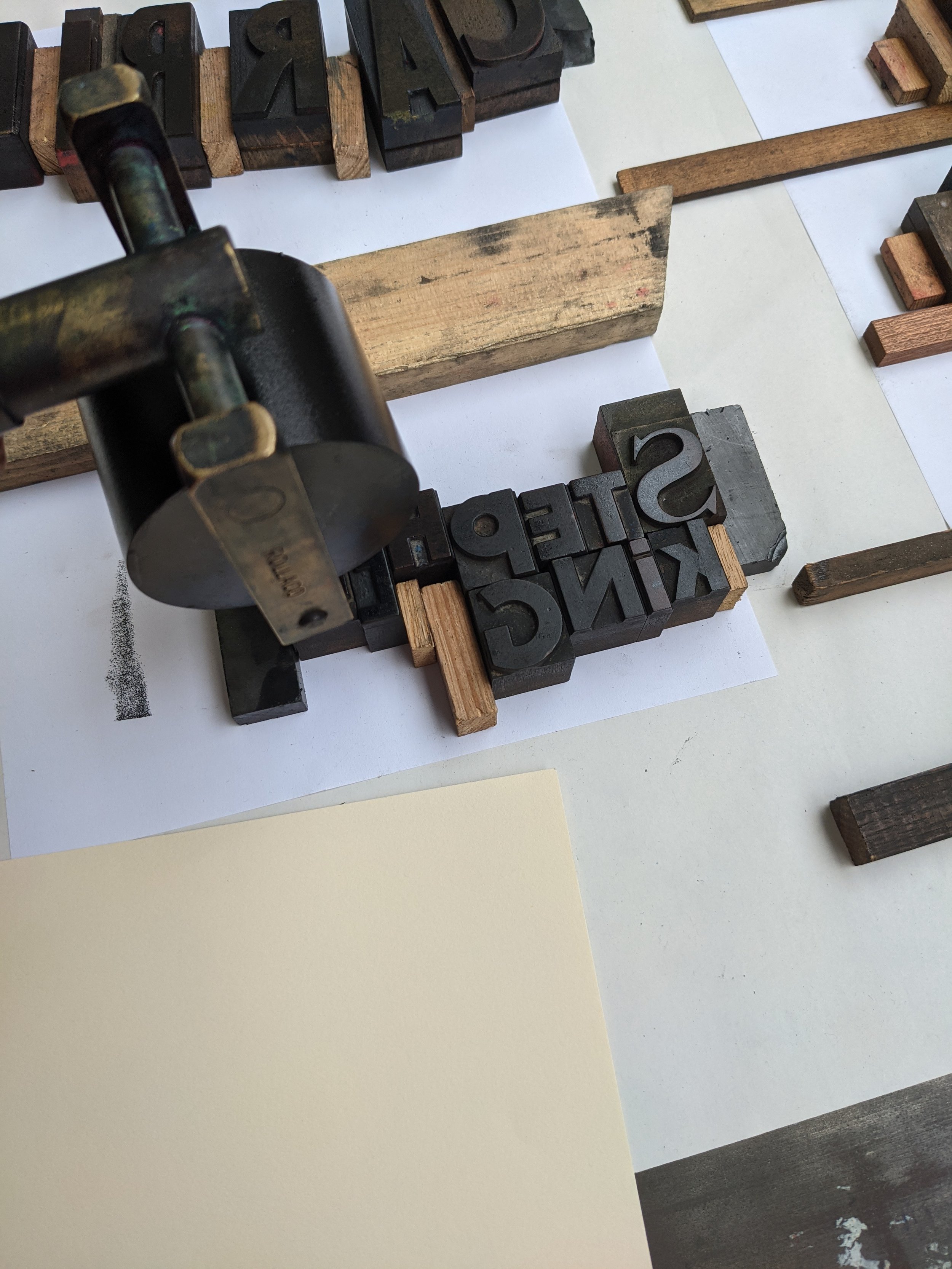
Inking the letters was perhaps the best bit. I didn't deviate from black since I intended to use digital manipulation and a higher contrast makes it easier.
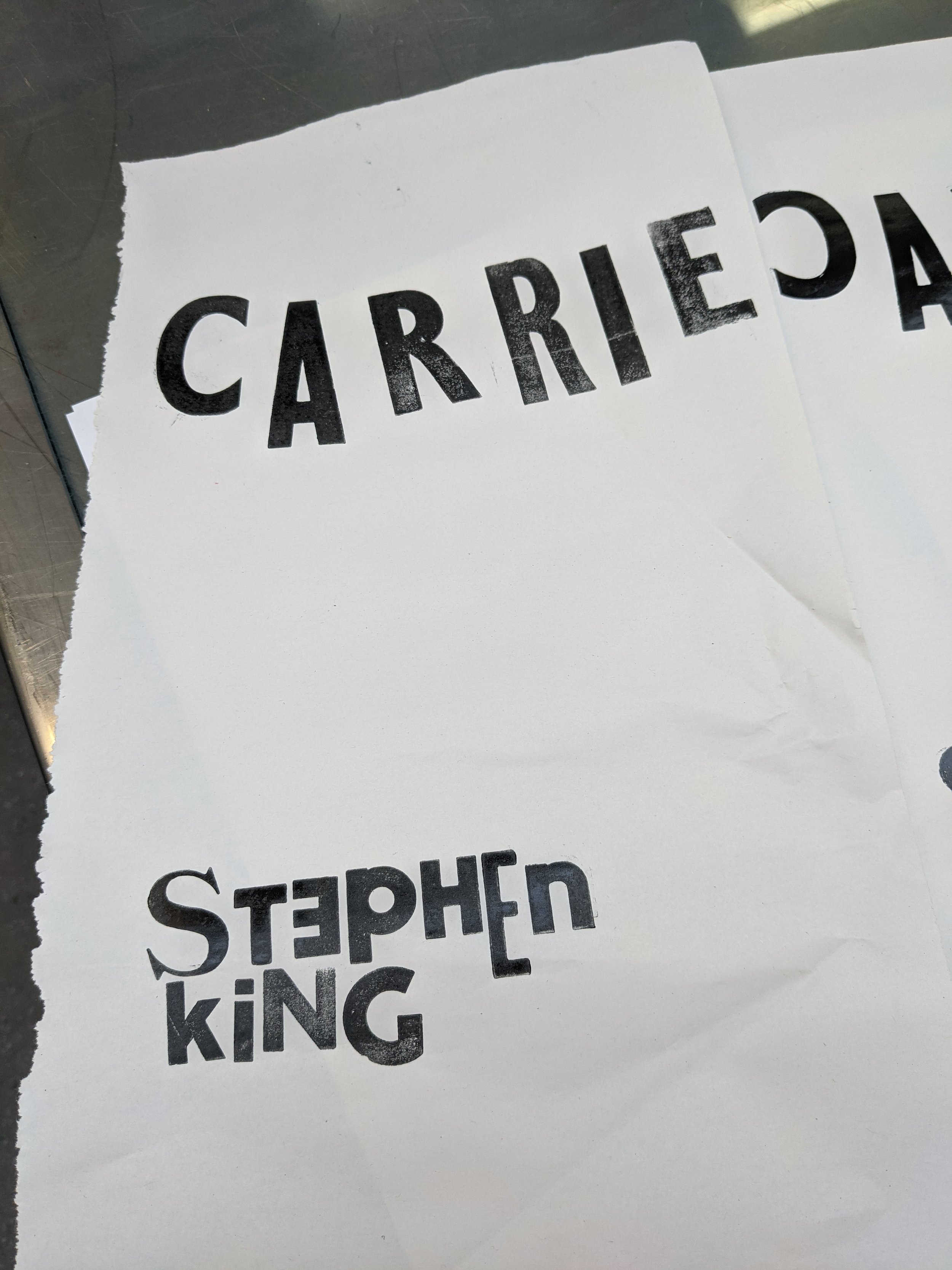
My first successful mock! It turns out it's kind of hard to place everything in the opposite way!
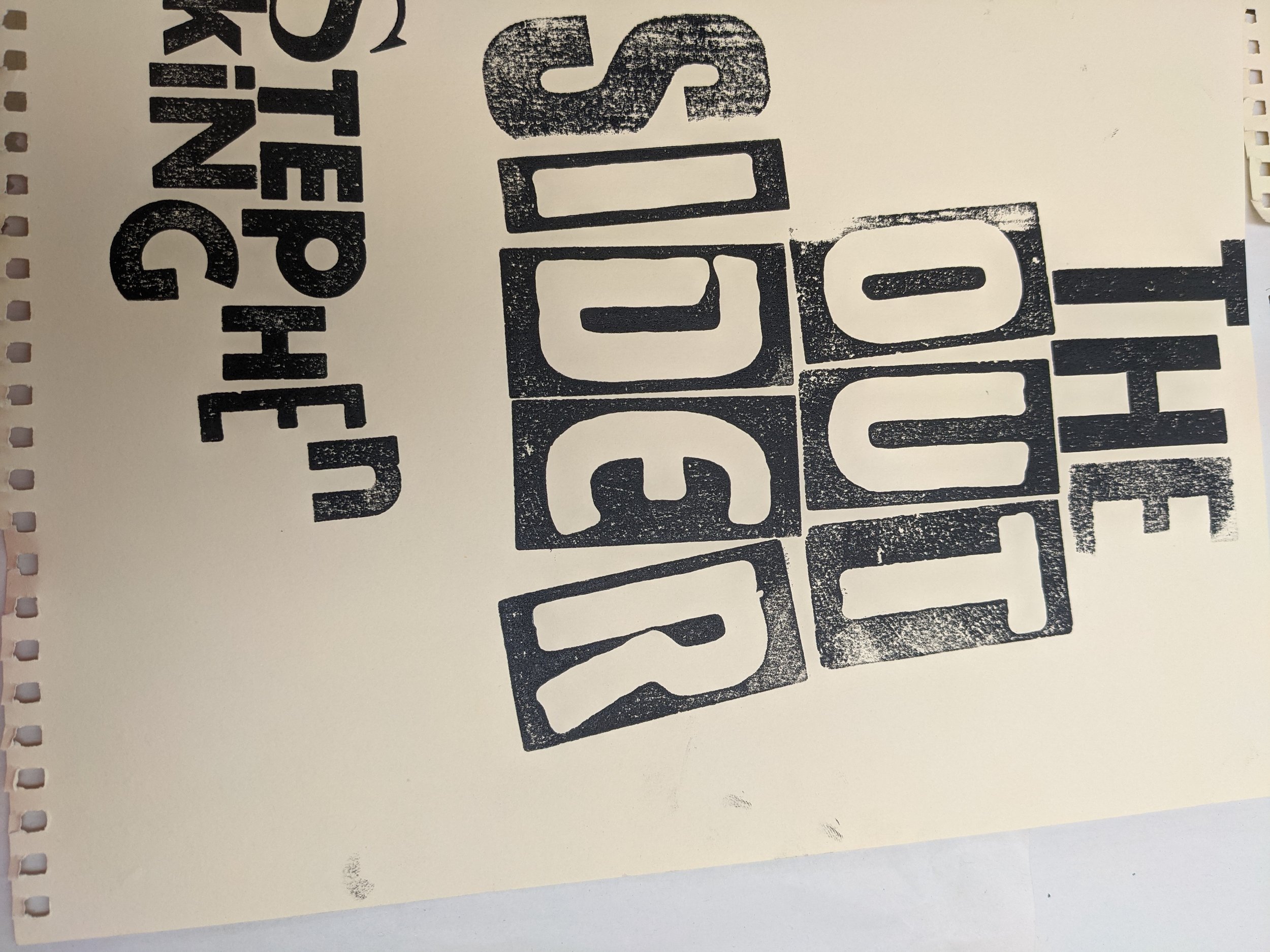
One of the negatives about using the university's letter press is that the letters are highly unorganised, and you probably won't be able to find every letter in a typeface and so I embraced that. I was particularly proud of this one for how the 'S' contrasts with the rest.

"Stephen King" stayed the same throughout, this is to create some semblance of uniformity.

What made me love the letterpress is how each print was vastly different. When they were to be digitised each one acted very differently.
Carrie's was the first one to be done, and it stayed the most simple.

IT's is kind of difficult to make into something unique but I loved using the letters where they were surrounded with the ink like above. It made it much more interesting!

Carrie was the first one I worked on. I simply digitised the letters on Photoshop and did a quick sketch. In my mind was a red wedding veil since Carrie is about the main character's loss of her innocence.

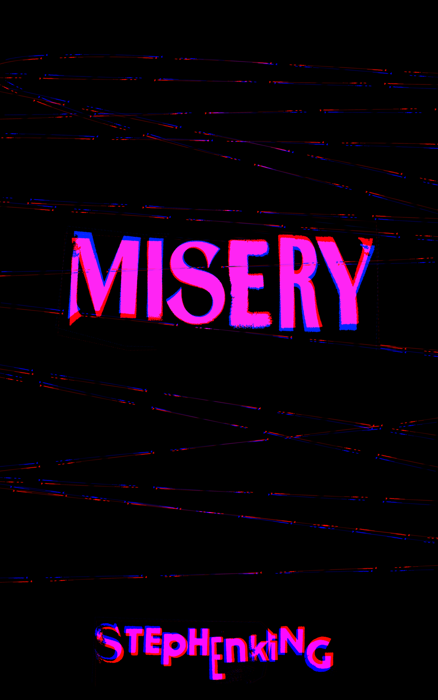
Legibility was something I wanted to play with, and I was also experimenting with each book having it's own "colour". For Carrie I chose pink since her prom dress was the same colour.
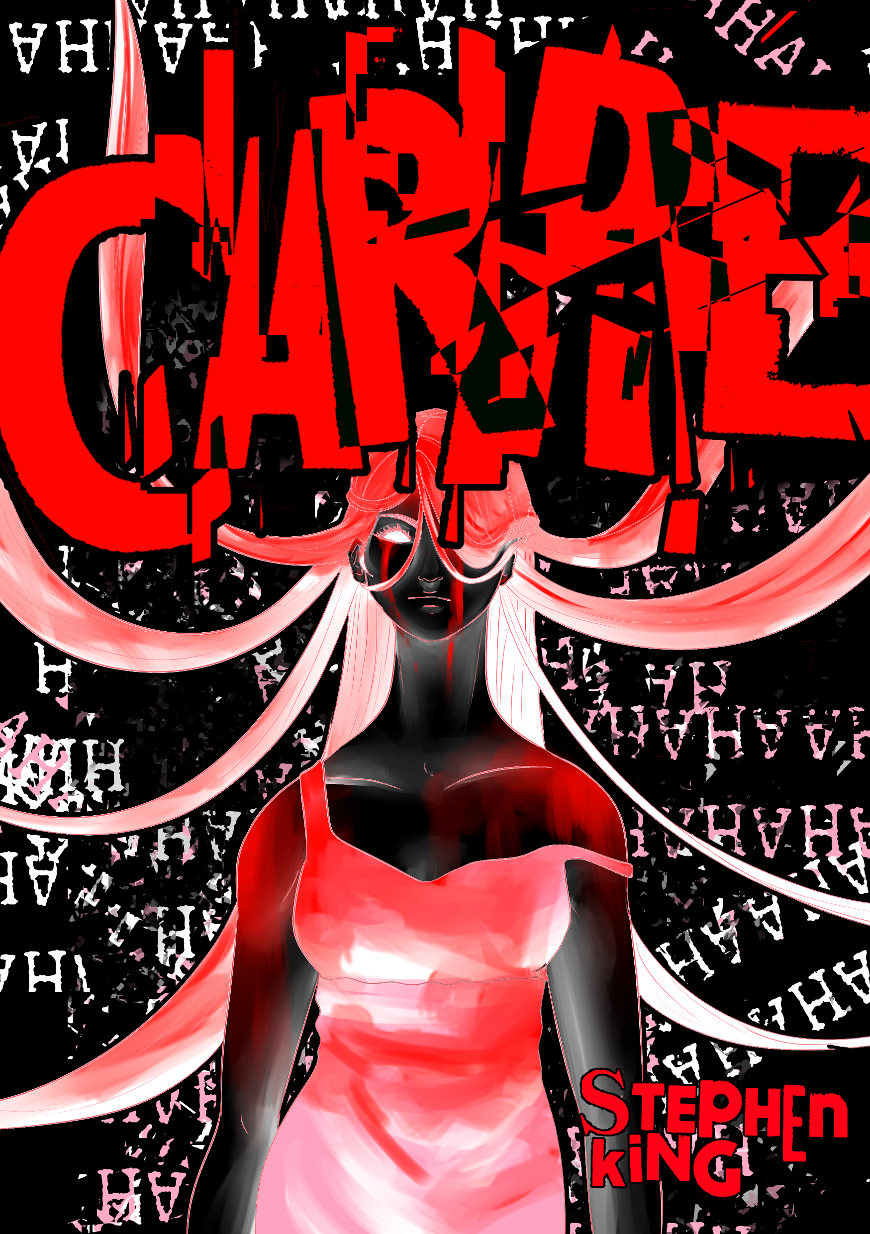
This is a further development of previous one. Playing more with the colours.

At this point I realised maybe keeping it more simple would allow for it to breathe. I made the A have a flame to symbolise the fire that sparks during the prom. The colours had to real symbolism but was a product of my experimentation.

I veered back into something more literal. Sadly it blends too much with the background, and so I didn't wish to go further with this. (Although I'm proud of the fire I did in the background!)

Wanting to keep a little bit of illustration I drew Carrie from above with her dress flowing behind her. This creates the look of female genitalia which is a big part of the book, and bought back signature colours.
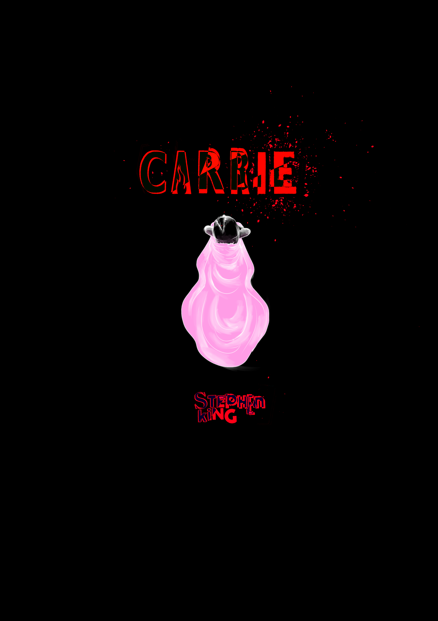
This is the final design! Legibility was something I wanted to experiment with and so I took it as far as I could go.
The very first draft for IT. I did all of the drafts at the same time, so they all have a massive emphasis on illustration.

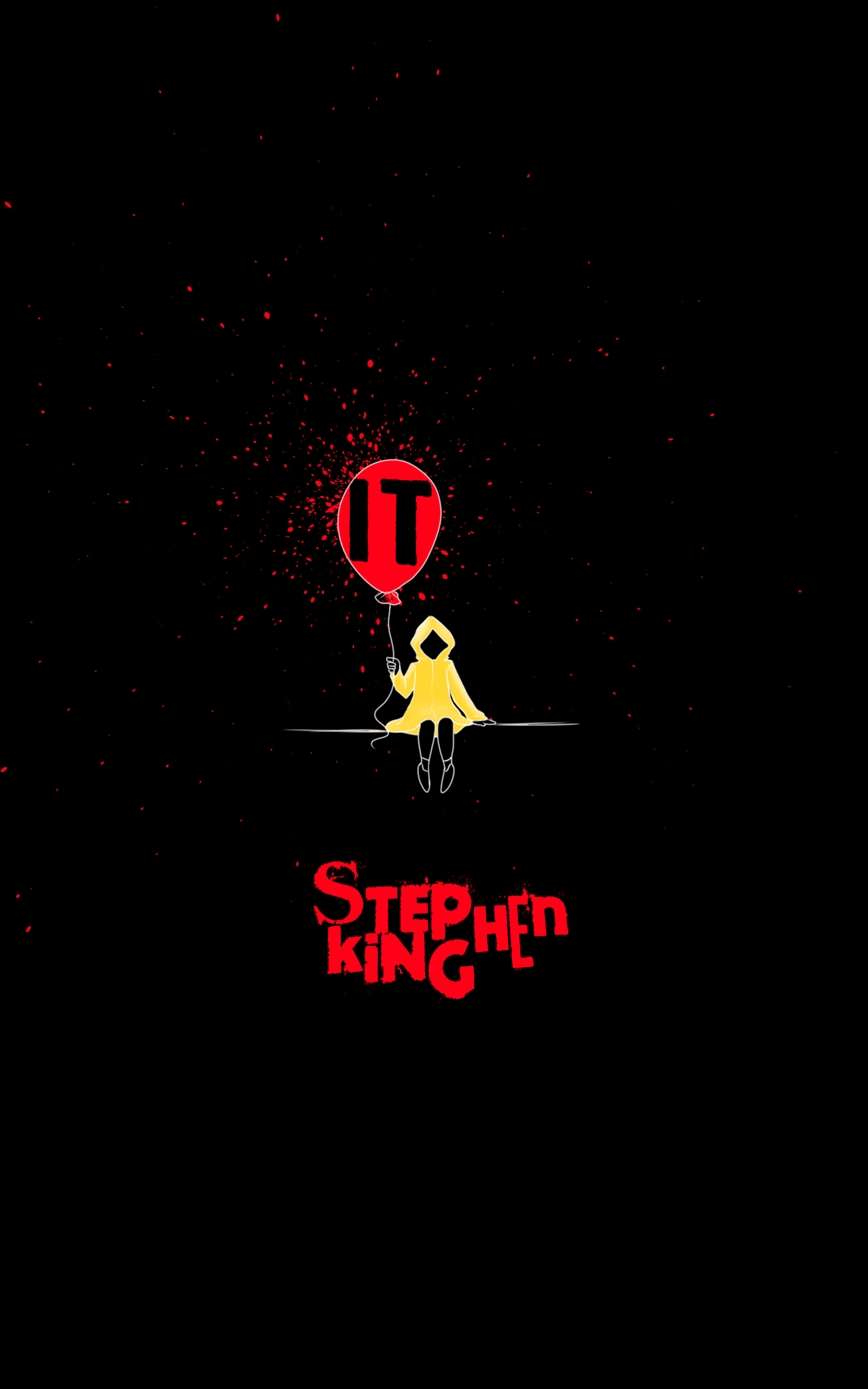
Bringing in colour, IT got yellow for the boy in the yellow coat. It's a scene people who have and haven't read or seen the movie will recognise. While this is made predominantly for fans, I wanted to include imagery to remind people what the book was.

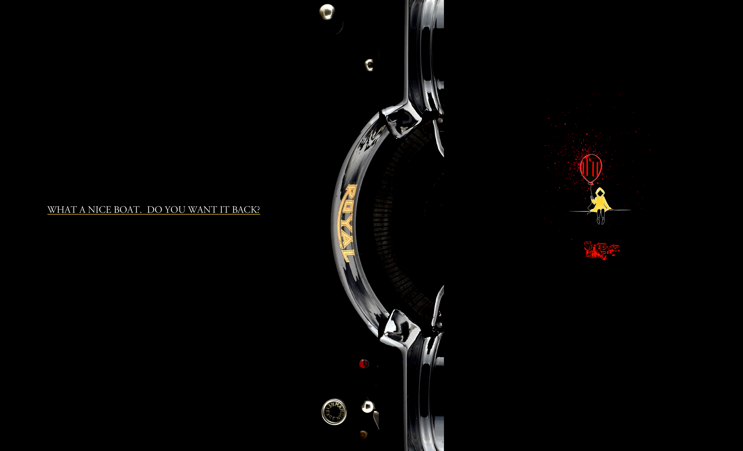
The balloon was something I really wanted to keep as I felt I could do a lot with it.

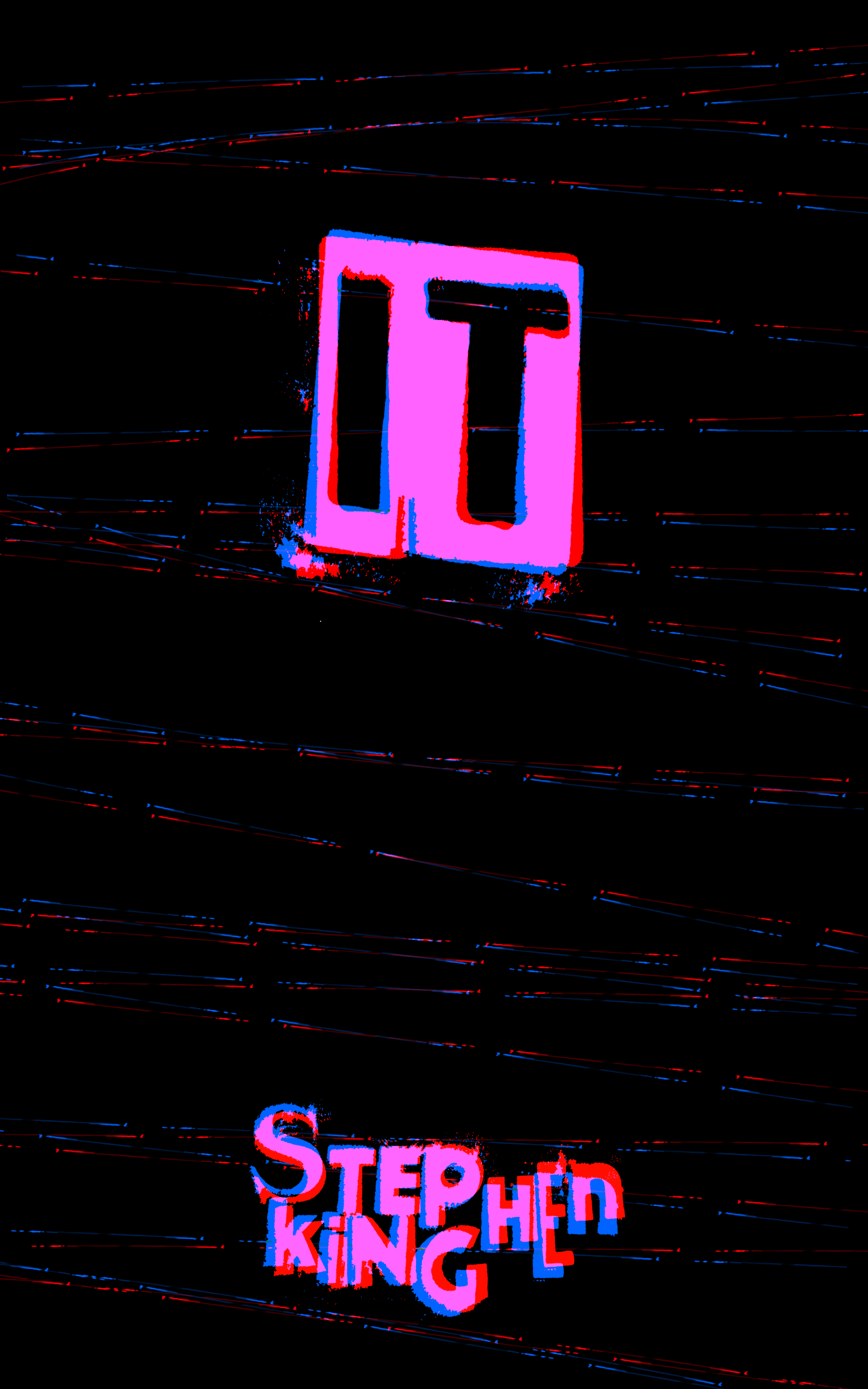
Going into a more type-focused design I wanted to go the opposite of small. I actually really like this! And if it were a one-off cover I would have developed this one further. People probably know of IT more than they do Stephen King.
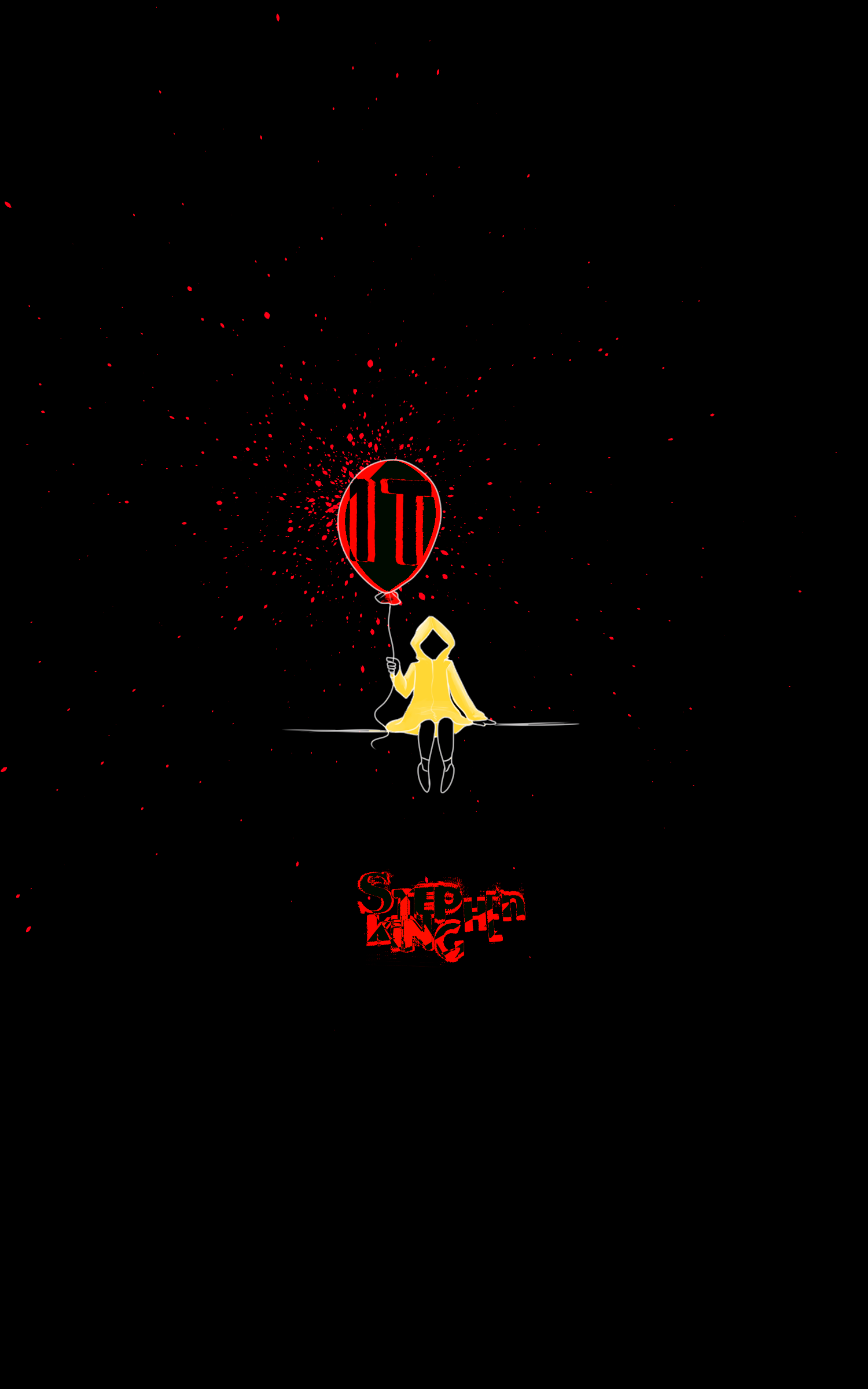
The same situation as Carrie. I wanted to see how it looked.
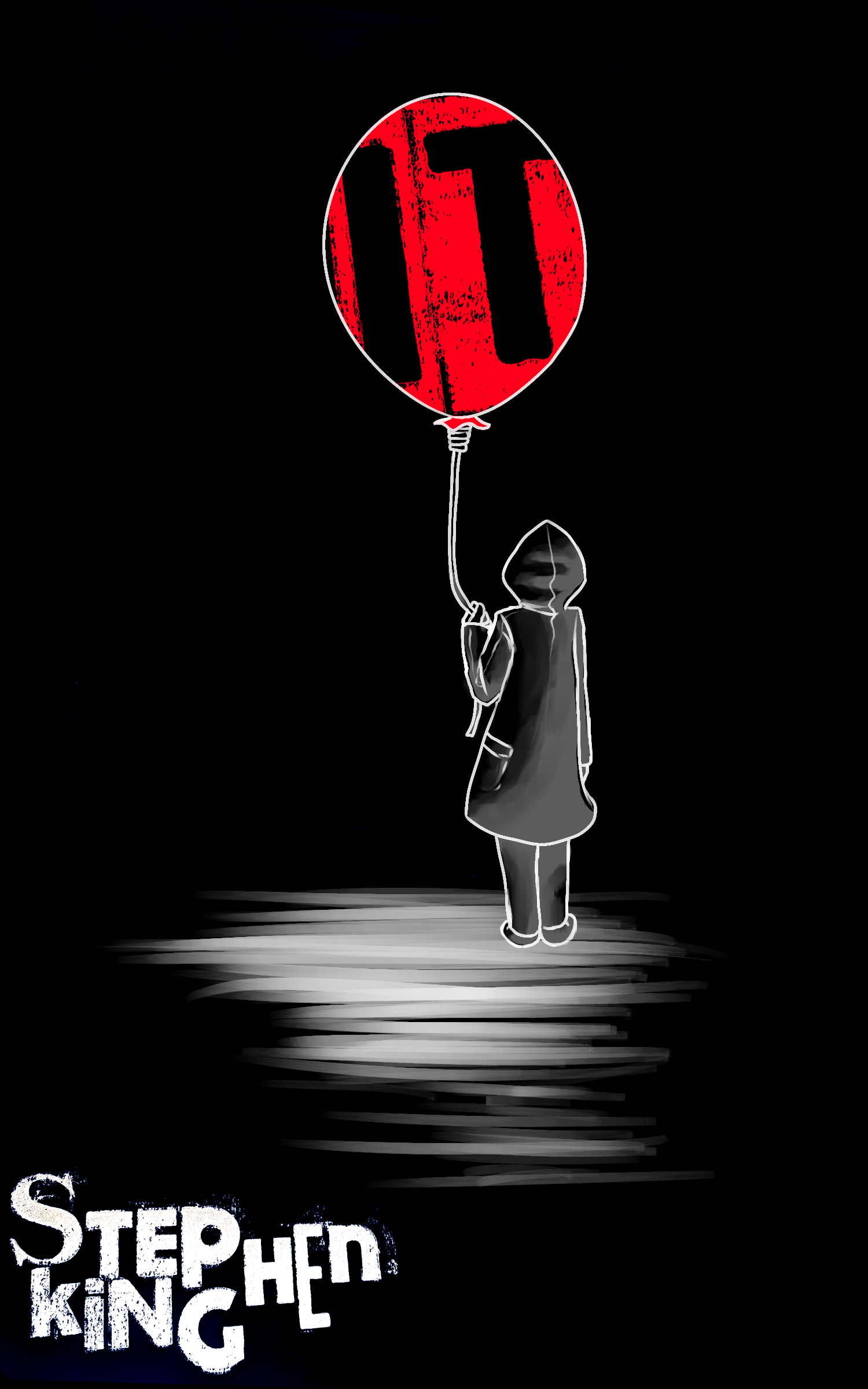
This was the final illustration. I kept it as simple as I could, with the boy having not a lot of detail.
Again with the legibility. This is the final cover design I ended up going with. IT and the boy are so easy to spot that in a collection of Stephen King books you would know what this book is without reading the title.

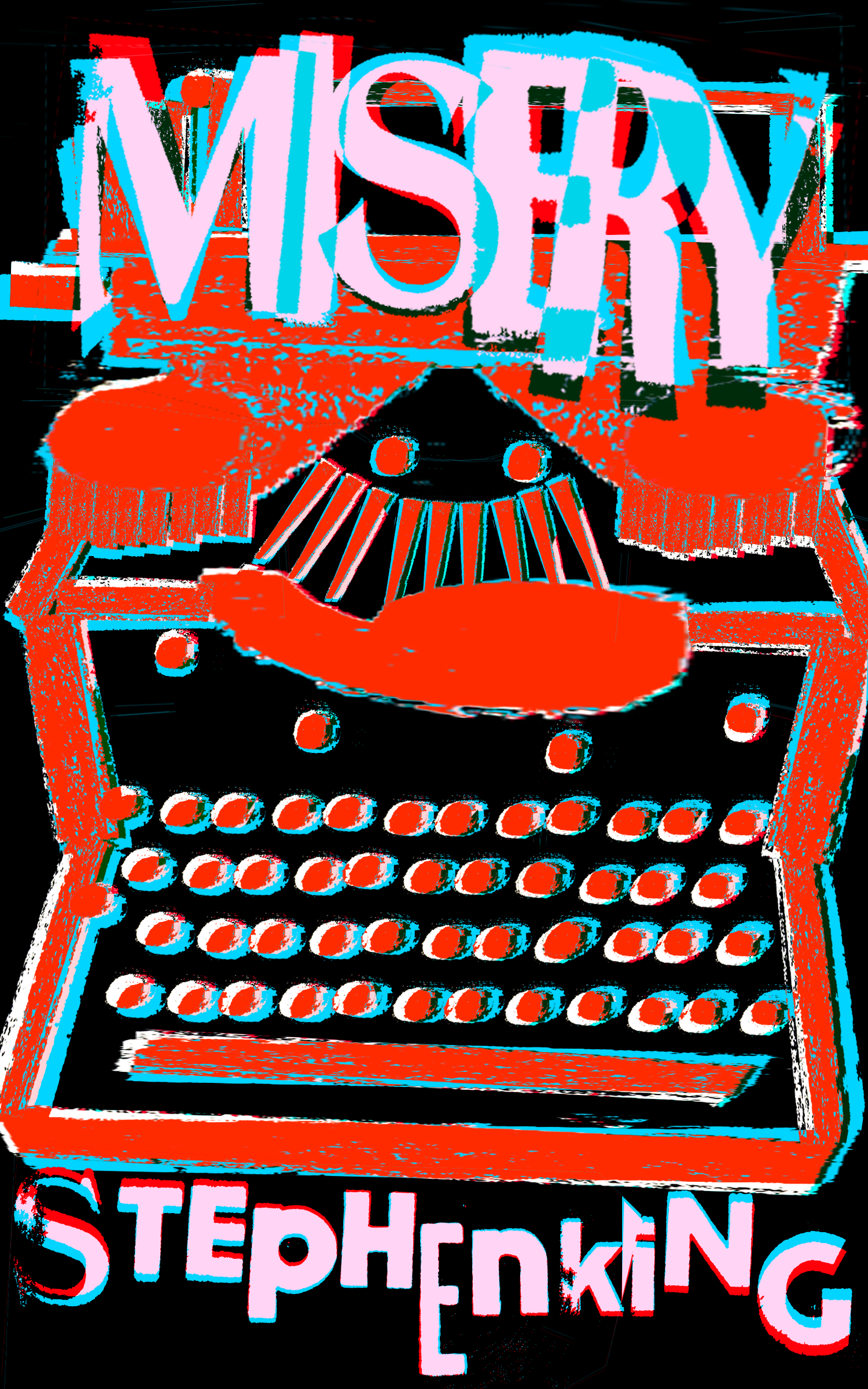
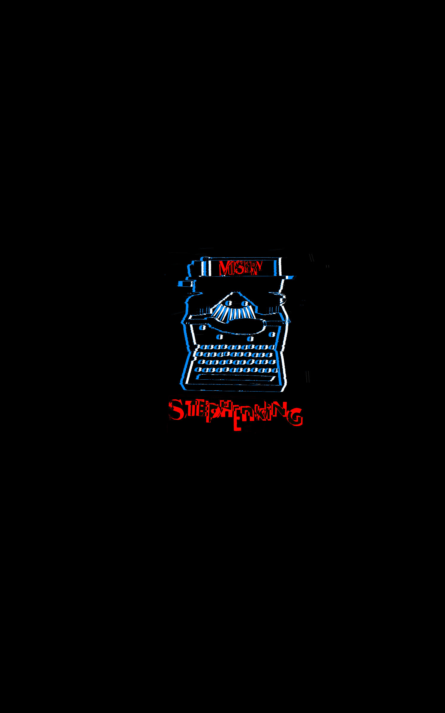
This cover is perhaps my favourite one to have worked on. The Royal 10 Typewriter was the one used in the story. For this I pressed a bunch of punctuation, as digitised them and maipulated them to be in the shape of the typewriter you see above.
At this point I was still deciding on the colour, I tried to experiment with the blue using different layer types!

Trying to see other avenues I did an illustrative based one. At the end of the book, before Annie tries to kill the main character they share a glass of champagne and that scene always felt so powerful.
Same as the other books, I love the type on the M and Y and how the tails box in the word in a way.

Another experimentation, this was mainly to see how it would look.

While shrinking the typewriter got rid of the grainy look, it didn't get rid of the detail and still evidently looks like one.
Finally bringing in the blue colour this was surprisingly difficult. Keeping the original fully blue made it look garish and so making the outlines blue makes it look darker and more interesting.

Salems Lot was the book I struggled with the most. Unlike the others, it wasn't as iconic but I wanted to include it because I'm a sucker for vampire stories. I drew the old house from the book.

I really did not like my first attempt. It was not good to look at and so I wanted to create a more eerie scene.

Salems Lot was determined to be the colour green. It was the only one that fit since illness was a theme in the book as well. Using that, I wanted to make the colours look sickly.

Wanting to focus more on the night and the moon I chose this. I actually really like it! It's not too detailed, it's simple and I honestly am really proud of it.

Looking back, I enjoy how 90s the title looks, but it's definitely not fitting for the book.

To fit with the other final designs, I focused on darkness surrounding the town. I also wanted the type to make way for the moon.

Here I brought colour into it. Making the green very subtle helped a lot. The red complementing with green makes the green in turn pop out a bit more!
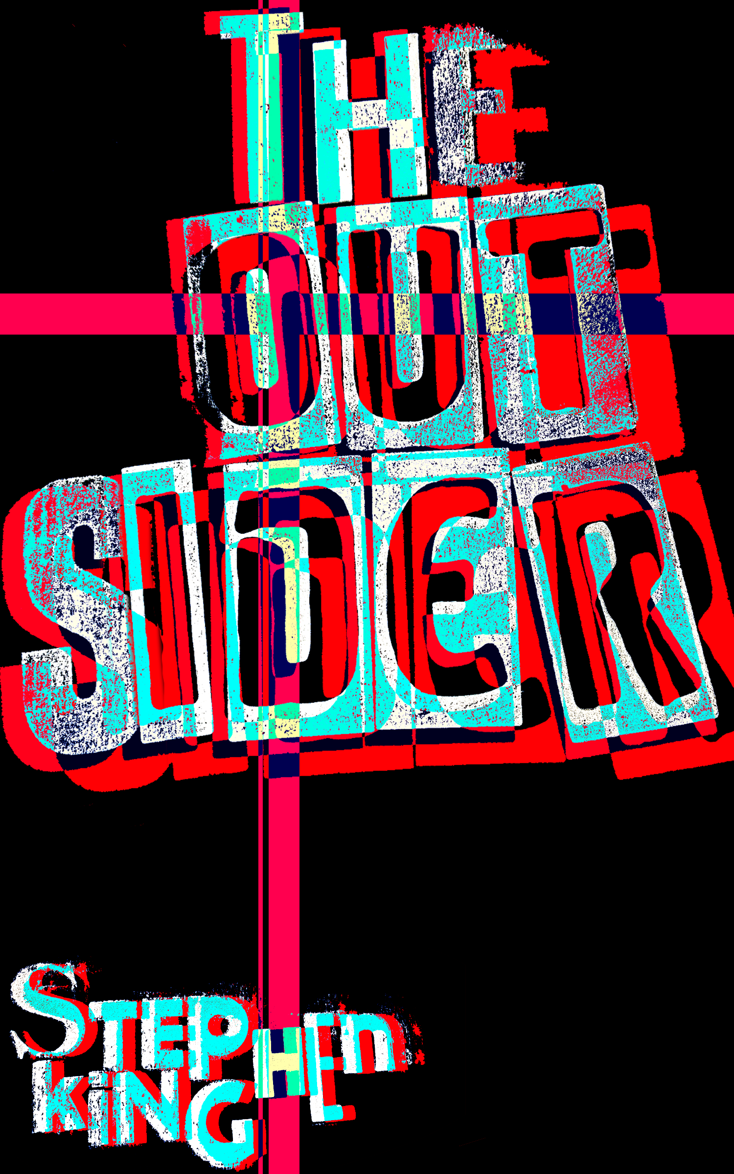
The newest book Stephen King made, I really enjoyed this read! I sadly did not enjoy making the cover as much. It felt the most difficult, with the imagery not being as easy to translate into an illustration.

For this I went for a polaroid kind of style, with the whole book focusing on a crime scene.

Going for something slightly more psychedelic. It's honestly really hard to read but I find a bit of charm in it.

This one was one that I actually quite liked, and while doing developments this helped guide the other books into focusing on smaller and simpler.

Same as the other books, it didn't work out that well sadly for this one.

I chose in the end Orange to be the colour of the book since it's about the idea American Family which is always shown as bright and perfect and Orange encapsulated this the most.

I really liked the cover for this one! I think it shows the general vibe of the book well and I kept it somewhat more legible since it doesn't have any illustrative elements to help it.